Crafting a Captivating Brand Story Through Color

We’ve been awash in Barbie pink lately – a testimony to how the brand has used their iconic color as a key part of its brand identity. Brands from big to small have been using color as an incredibly powerful and versatile element when it comes to crafting a successful go to market strategy. It plays a significant role in shaping perceptions, emotions and creating associations in the minds of consumers. This blog provides industry insight along with several examples on how color can be harnessed effectively to enhance your brand’s go to market strategy.
From pink to purple to green and colors in between, let’s take a look at brands that embrace this powerful brand element. Barbie has leveraged pink for decades and is a very important color in the Barbie brand story.
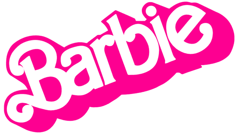 Mattel uses pink to convey its message of empowerment and opportunity for children. Since her creation in 1959, Barbie has become a global icon of confidence, independence and overall positivity.
From her clothes to her homes and cars, Barbie is designed to stimulate the imagination. Barbie dolls are surrounded by the color pink as the color can help to create an environment of fun, excitement and creativity.
In addition to these positive associations, pink is also seen as a symbol of empowerment and femininity. Barbie has always been a role model for girls, and she shows them that they can achieve anything they set their minds to. As evidenced in the latest blockbuster movie, with positive portrayals of female characters (president, Supreme Court justice, doctor, writer, physicist, lawyer,) the pink color of Barbie dolls can help children to feel confident and powerful, and reminds them that they can be anything they want to be.
Pink is also used in Barbie’s marketing materials, including packaging, wardrobe, playsets and in brand commercials. The use of pink helps to create a consistent and cohesive brand identity for Barbie, and it helps to communicate the brand’s message of empowerment and opportunity.
When did John Deere embrace green in its branding?
John Deere has been using green since the company was founded in 1837. Green is associated with nature, growth, and prosperity, which are all qualities John Deere wants to project for their brand. The company’s early products were used for agricultural purposes, and green was a natural choice for the company’s branding.
 The use of green in John Deere’s branding has evolved over time. In the early days, the company used a darker green color. This color was more muted and less vibrant than the green that is used today. The darker green color was seen as more serious, which was appropriate for a company that was selling agricultural equipment.
In the 1960s, John Deere began to evolve their use of green into a brighter, more eye-catching and modern lighter green. This new color was in line with the company’s efforts to expand its product offerings and reach a wider audience. The brighter green color is still used by John Deere today, and is one of the most recognizable colors in the world.
In addition to the color green, John Deere also uses gold as a secondary color in its branding. The combination of green and gold is effective and serves multiple purposes. Representing both the company’s roots in agriculture as well as success for the company, and its customers, this color combination is instantly recognizable and helps to create a strong and positive brand identity for John Deere.
What about Tiffany blue?
Tiffany & Co’s distinctive light blue color has become synonymous with the brand and associated with luxury, sophistication, and romance. Their iconic Tiffany blue box is distinctive and coveted. This is so much so, that the popular color has even been given its own Pantone® color number: 1837 Blue, aptly named after the year that Tiffany & Co. was founded.
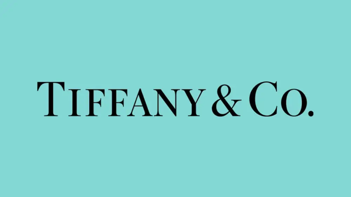 This special color is an important part of the company’s brand story and helps build upon Tiffany & Co’s tradition of timeless elegance and quality.
As a luxury jewelry company, Tiffany & Co. aka Tiffany’s, has leveraged their unique Tiffany blue to represent their brand – signifying quality goods, timeless elegance, exclusivity and prestige. Tiffany’s often uses the light blue, robin’s egg color in their high-end jewelry as well as in their retail stores and website. Having a color that is distinctly identifiable for their brand helps to reinforce their message of sophistication, romance and luxury. Passing along the sophistication of wearing something from Tiffany’s to their customer.
Tiffany blue is also associated with romance. The distinct color of the Tiffany blue box can create an element of surprise and anticipation. Opening a Tiffany box can evoke a sense of excitement and delight, making the act of receiving the gift itself a memorable experience. Tiffany & Co. wants its customers to feel love and happiness when they wear their jewelry, and the use of Tiffany blue in their packaging helps to reinforce this message; by encompassing the emotions, sentiments and associations that come with the brand’s reputation and legacy.
Tiffany & Co. has been using Tiffany blue in its branding since the 1840s. The color was first used on the company’s Blue Book, which is an annual catalog of the company’s jewelry collection. The Blue Book was a very popular publication, and the consistent use of iconic Tiffany blue helped to make the company’s name synonymous with luxury and sophistication.
Today, Tiffany blue is one of the most recognizable colors in the world. It is used throughout the company’s products, from jewelry to home goods and their “little blue box and white ribbon” packaging and are even trademarked. The color has helped to create a strong and positive brand identity for Tiffany & Co., and it is one of the key factors that has contributed to the company’s success.
Does any brand use purple?
Yes, many brands use purple in their branding as it’s a versatile color that can be used to convey a variety of messages. It is often associated with luxury, royalty, creativity, and innovation. Brands that use purple are typically trying to convey a sense of sophistication, confidence, and excitement. Cadbury, for example, the British chocolate company, has been using purple in its branding since the early 1900s.
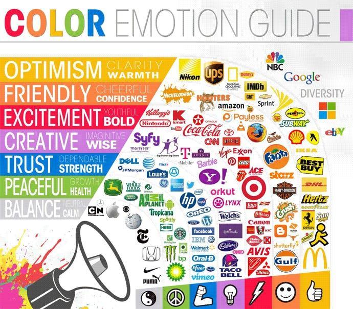
Colors aligned with brand characteristics
It is important to note that these are just general associations, and the meaning of a color can vary depending on the context. For example, red can also be associated with danger or anger, and black can be associated with sadness or mourning. It is important to consider the target audience when choosing colors for your brand.
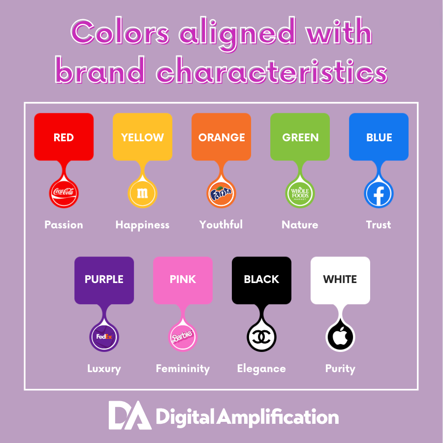
For example, a brand that is targeting children might want to use brighter colors, while a brand that is targeting professionals mighr want to use more muted colors
Wrapping Up
Color is a powerful tool that can be used to inform any brand story. The colors you choose for your brand can evoke certain emotions in your audience, and they can also help to create a visual identity that is unique and memorable. The color wheel, which is a chart or illustration of how colors relate to each other is often. Building upon the primary, secondary and tertiary colors of a brand, color schemes can be identified
Additional helpful ideas include:
- Use color psychology to your advantage. As we’ve seen, different colors have different associations, so it is important to choose colors that are appropriate for your brand and your target audience. For example, red is often associated with passion and excitement, while blue is associated with trust and reliability.
- Be consistent. Once you have chosen a color palette for your brand, use it consistently across all of your branding materials. This will help to create a strong and memorable brand identity.
- Don’t be afraid to experiment. You can use color to create a sense of excitement and intrigue in your branding. For example, you could use a bold color combination or a gradient to create a visually appealing and memorable brand.
- Get feedback from others. Once you have finalized your brand colors, get input from others to make sure the colors reflect your brand story. others to make sure the colors reflect your brand story.
 Ultimately, the best way to choose colors for your brand is to do your research and experiment with different combinations until you find a color scheme that you like. Incorporating color strategically into your brand’s go-to-market strategy requires careful consideration of your target audience, industry, and desired brand personality. By understanding the psychological, emotional, and cultural influences of color, you can create a visual identity that resonates with your audience and contributes to the success of your brand in the market.This article was conceived and outlined by the DA team; the draft was then supplemented by an AI writer; it was revised and edited by Digital Amplification’s team of marketing experts. It’s written for marketers and business leaders looking for ways to improve the performance of their marketing investment. People ask why an elite digital agency would share key insights about essential marketing techniques. The answer is simple, if you are reading this and it helps you become a more effective marketer…connect with us because we would love to get to know you. Likewise, if it helps you see the gaps in your marketing efforts and you need a partner that can move the business forward…contact us because we can deliver breakthrough results.
Cheers to your success!